City Connect uniforms hit the baseball diamond beginning the 2021 season, allowing MLB teams a chance to flash some creativity and honor their homes with unique logos and differing color schemes.
In the midst of the '25 season, 28 teams have their own edition, which are mostly worn during Friday home games. Only the New York Yankees and Athletics are without a City Connect uniform. Maybe that will change for the A's when—or if?—they leave their temporary home of West Sacramento for Las Vegas. Don't bet on anyone ever messing with the Yankee pinstripes, though.
The other 28 MLB teams, however, don their own flare through a unique City Connect uniform. Some make sense upon first glance and others, well, you have to look a bit closer. This season, eight teams debuted a second City Connect design—an opportunity to take a new approach and give fans what they really want (cue the new Red Sox Green Monster-inspired jerseys).
Here's each City Connect uniform you could see on the field this season, ranked from worst to best:
28. Texas Rangers
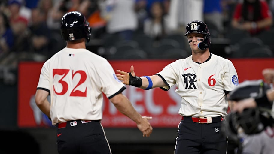
The logo and font—which is a nod to three disbanded Minor League teams that paved the way for the Rangers' existence—is nice. But something about the cream-colored jerseys paired with the dark navy pants doesn't sit quite right.
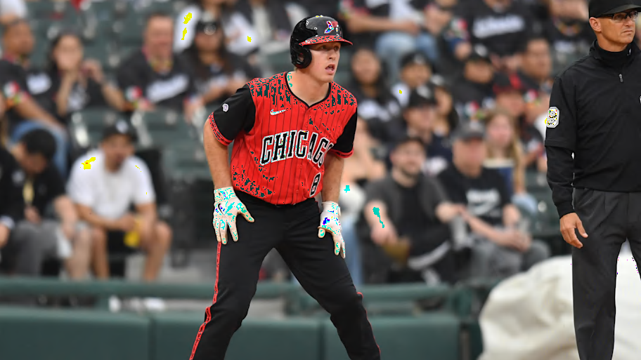
27. Chicago Cubs
For the ivy. For Wrigleyville. For #All77 of Chicago’s neighborhoods.
— MLB (@MLB) June 8, 2021
These are the @Cubs’ Nike City Connect uniforms. pic.twitter.com/8kkZ2pEDe6
The Cubs lose points because they've seemingly ditched their "Wrigleyville" City Connect uniforms, but they could definitely use a new set, too. They haven't worn the dark navy uniform so far this season, which is understandable after the franchise released new powder blue alternate jerseys. The baby blue Cubs uniform is an absolute classic, but since that uniform isn't technically a City Connect edition, it can't make the cut here. Maybe we'll see Chicago get a new City Connect uniform in the future.
26. Los Angeles Dodgers
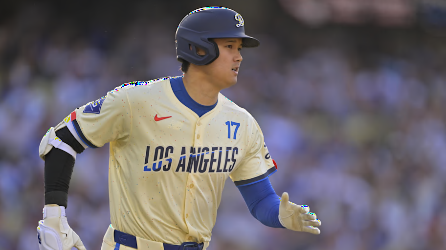
L.A.'s second City Connect uniforms, which they debuted in 2024, are a mix of past and present. They include futuristic numbering and lettering, plus a galaxy pattern throughout in the colors of Dodger Stadium. The logo on the hats and helmets are nice, adding a "D" over the classic "LA" logo, but the Dodgers could've went another way with this one.
25. Minnesota Twins
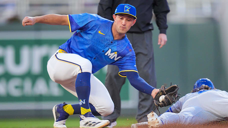
The Twins made an ode to the Land of 10,000 Lakes as their approach. The unique pattern across the jersey is meant to evoke ripples in the surface of a lake, which is a nice touch but looks a bit busy on a baseball uniform. Purple Prince-inspired City Connect uniforms, when?
24. Detroit Tigers
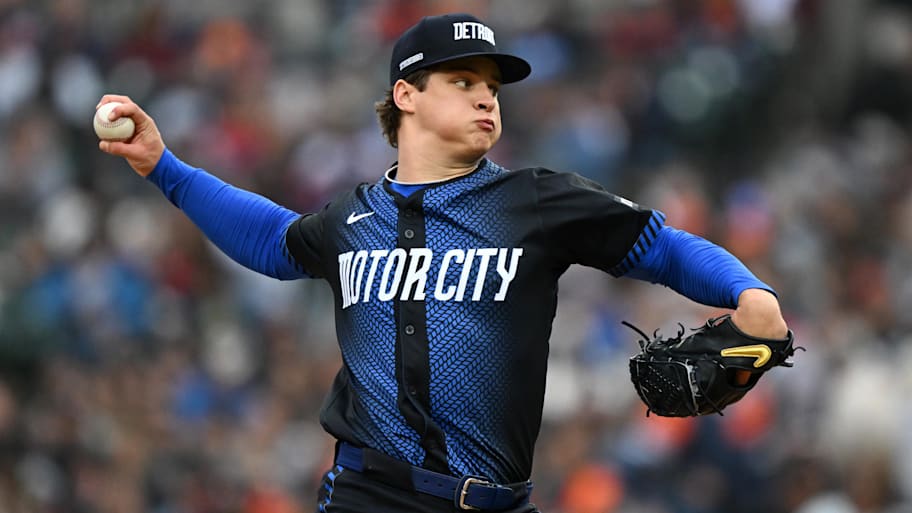
The color scheme is solid and the hat even pays tribute to each year the Tigers won the World Series in vehicle identification number form. Count me out for the racing stripe down the middle of the jersey, though.
23. Pittsburgh Pirates
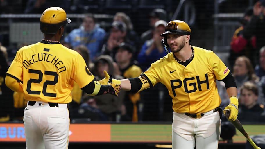
It would feel weird for a Pittsburgh team to have a uniform that wasn't black and yellow, so it's nice the Pirates stayed true to their colors. If you look closely, the texture printed on the jerseys honor some Pittsburgh history, including the Roberto Clemente Bridge. But the lettering for both the "PGH" on the front as well as the names and numbers feels a bit off.
22. Kansas City Royals
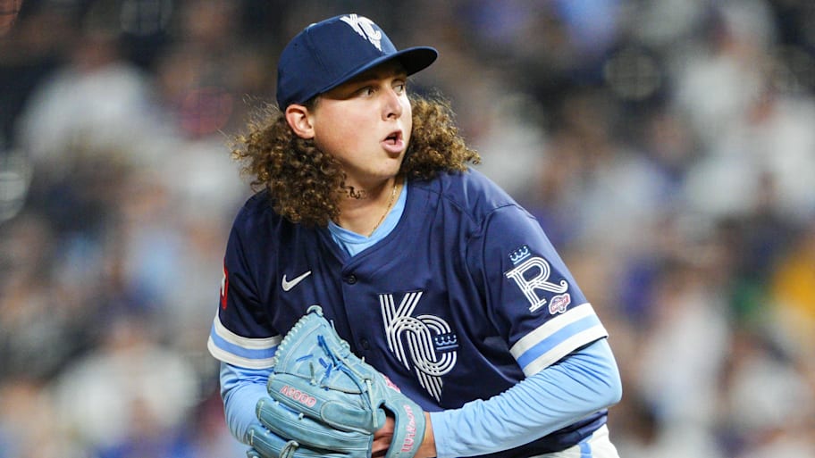
These are great looking navy jerseys, especially with the classic Royals powder blue and white trim. The logos are inspired by the fountains across Kansas City, as well as those in the outfield at Kauffman Stadium. You wouldn't realize that just by looking at them, though. Great idea and color scheme, but the execution could be better.
21. Baltimore Orioles
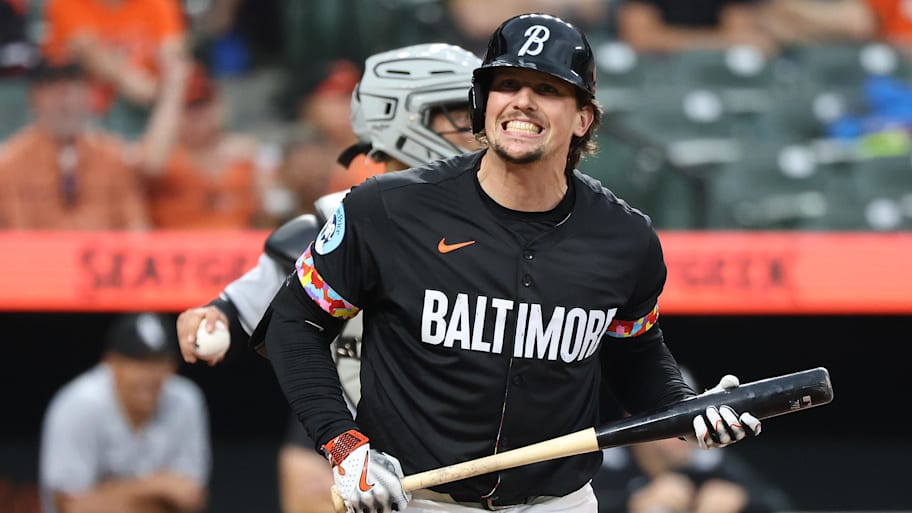
The pattern on the sleeves which matches the trim on the inside of the jersey is the best part of the Orioles' City Connect jerseys. Otherwise, they're just a black alternate jersey. A clean one at that, though.
20. St. Louis Cardinals
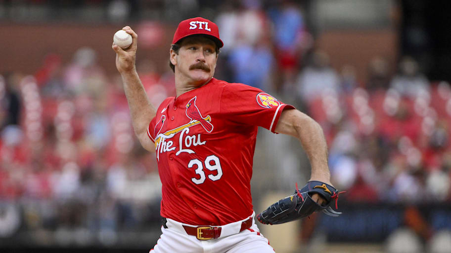
The Cardinals went with a plain approach, but these are clean. It's nice that St. Louis has a red jersey added into their rotation for the first time in franchise history once their City Connect uniform was unveiled in 2024. Maybe they'll take a more creative approach for their next edition but in the meantime, these are fine.
19. Milwaukee Brewers
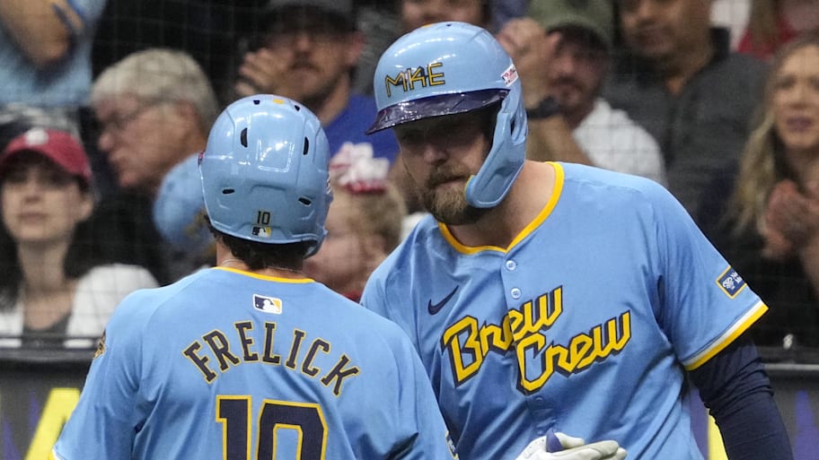
The "Brew Crew" nickname across the front is awesome and the light-blue base color the Brewers went with looks nice paired with the yellow and dark navy. Embedded within the MKE logo on the helmets and hats is 414, which is Milwaukee's area code. My favorite part of the Brewers' City Connect kits is a patch on the sleeve of the jerseys of a grill with baseball stitching. These scream summer in the Midwest.
18. Philadelphia Phillies
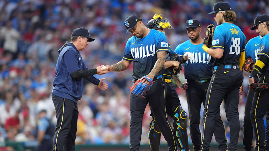
The Phillies' City Connect uniform don't look like a Phillies uniform at all. But, maybe that's the point. The blue-and-yellow color scheme is based off the city of Philadelphia's flag and the hat features a Liberty Bell logo. Although these grow on you with time (as much as a two-toned faded uniform can), let's hope the Phillies are in for a Phillie Phanatic refresh for their next City Connect edition.
17. Cincinnati Reds
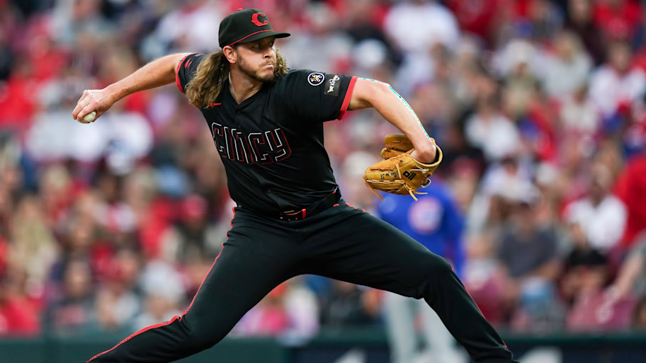
An all-black baseball uniform during the summer heat is certainly a choice, but the Reds did a nice job executing it. The hats feature a modern-looking "C" logo, which is a cool change of pace from Cincinnati's traditional uniforms. The uniform includes a patch with the city's motto and also has a buckeye leaf for the state of Ohio. Mr. Red should have made an appearance somewhere though.
16. San Francisco Giants
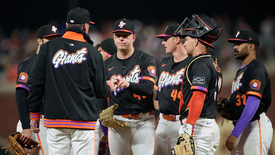
The Giants received new City Connect uniforms this season, which are inspired by San Francisco's musical history. The purple is a nod to the franchise's New York origins, where they wore violet from 1913 to '17. The unique Giants script across the jersey is influenced by psychedelic, Grateful Dead-esque posters. With many elements at play, the Giants did a good job threading the needle with their refresh, although I could do without the two-toned cap brim.
15. Houston Astros
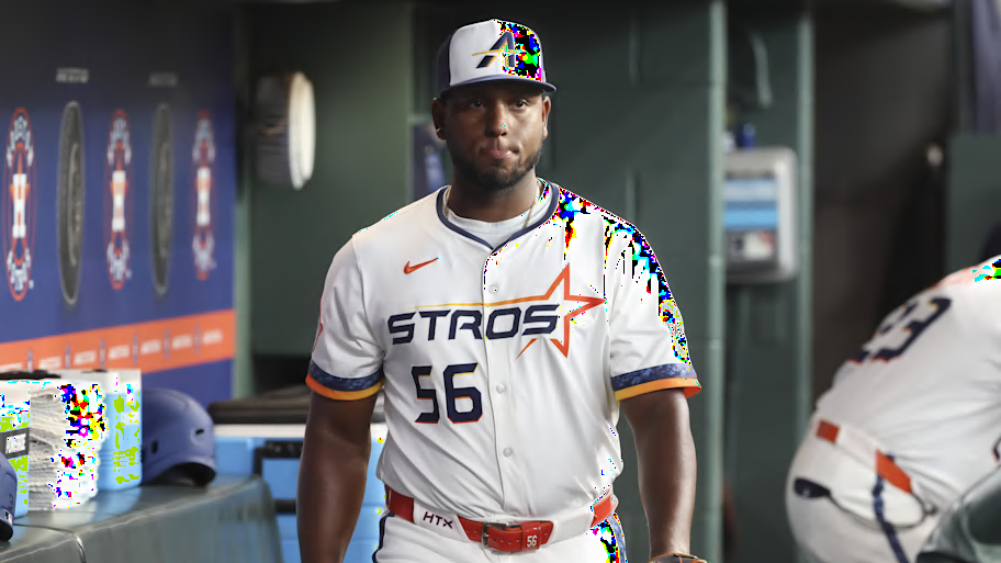
Houston is one of the squads who unveiled new City Connect uniforms this season and the Astros went with a clean, all-white approach. The great majority of fans call them the 'Stros, so why not put it across a jersey? A new, futuristic logo appears on the caps and the helmets which is a nice adjustment from the classic "H" on their daily threads.
14. New York Mets
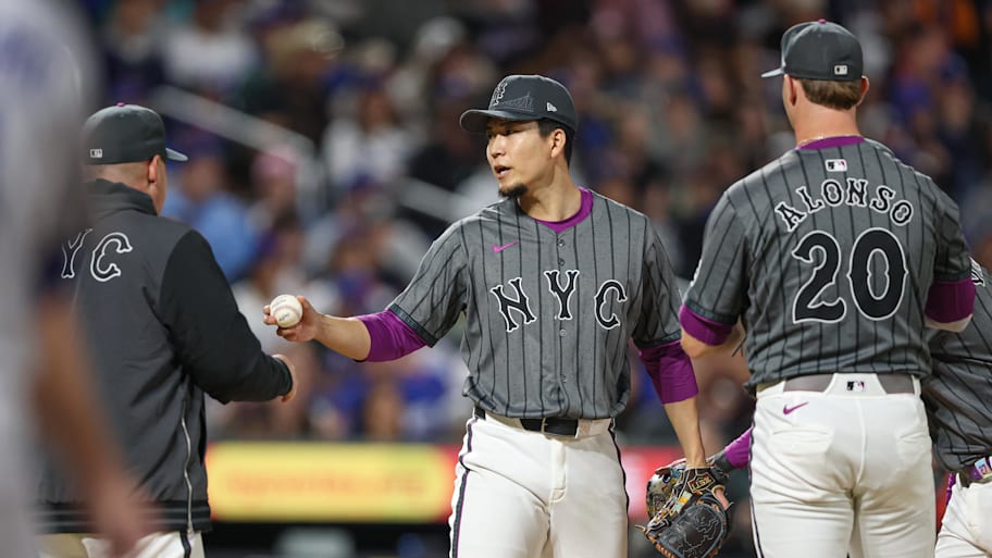
You'd think the purple tones within the Mets' City Connect uniforms are related to Grimace and the impact the furry purple blob had on the team's magical run last season, but the accents are really for the 7 Line that runs to Citi Field. The gray base represents the concrete jungle of New York City and the front of the hat and helmet features the Queensboro Bridge. A patch on the sleeve mimics a NYC subway token, too. Points for understanding the assignment, whether you love or hate the outcome.
13. Cleveland Guardians
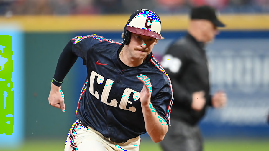
On first look, the Guardians' City Connect uniforms look plain. But the more you look at them and think of Major League and Ricky "Wild Thing" Vaughn thanks to the shoulder and pant stripes, the more you see a top-tier alternate jersey.
12. Atlanta Braves
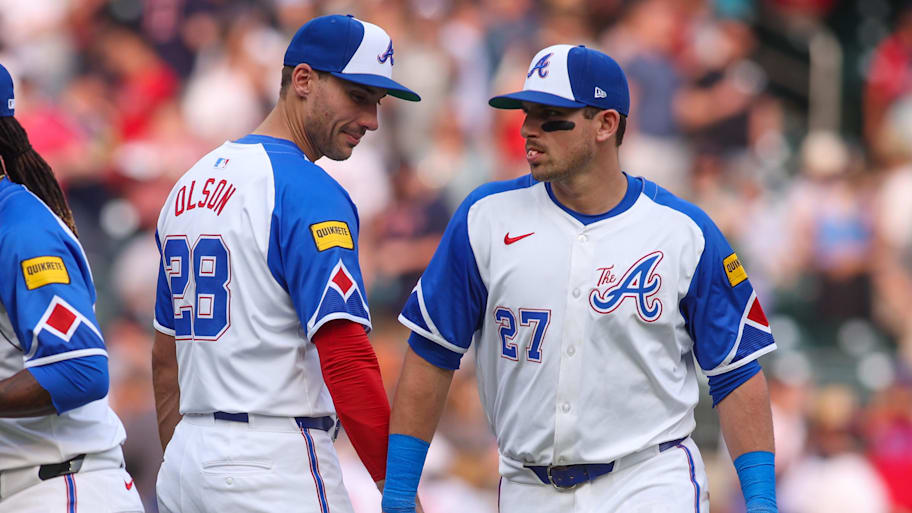
The Braves made a perfect mix of classic and modern with the Hank Aaron-era uniforms with an added "The A" for the logo. These are clean and bring all the nostalgia.
11. Seattle Mariners
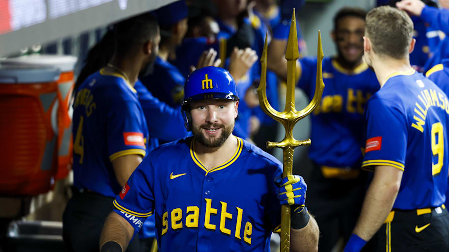
With the trident as part of Mariners home run celebrations, it only makes sense the trident logo made an appearance with Seattle's City Connects. The colors and fonts pay tribute to the Seattle Pilots, who existed in 1969 as their sole season before the franchise moved to Milwaukee and Seattle was eventually awarded an expansion team—the Mariners. The color scheme matches the Mariners' original colors, too. Plus, the deep blue and black screams Pacific Northwest.
10. Colorado Rockies
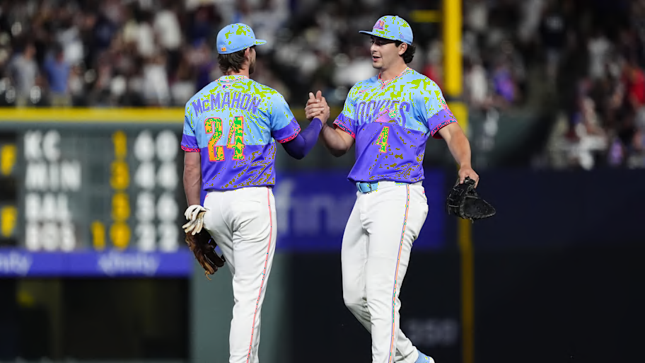
A little vintage Taco Bell-esque, sure. But a tip of the cap to the Rockies for the creativity with their new City Connect kits. The color scheme is inspired by Colorado sunrises and sunsets from the Rocky Mountains. These are the first City Connect pullover jerseys to debut, too—cue the Little League nostalgia. Plus, if you look closely enough, you'll spot a ripstop pattern—inspired by ski and snowboard clothing.
9. Los Angeles Angels
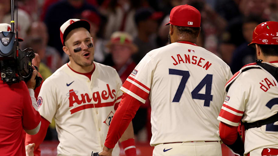
The Angels get points for a clean, classic uniform here. These might even rival their standard set of uniforms. The diamond around the numbers on the front of the jersey of course references a baseball diamond, but it's also an ode to early surfboard logos. A retro, beach-themed uniform—the Angels understood the assignment.
8. Washington Nationals
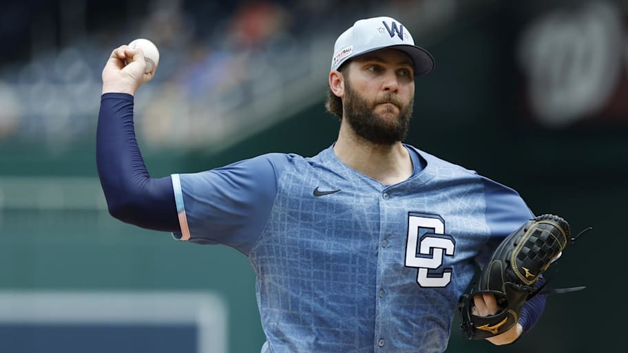
It's a bummer that the Nationals moved away from their cherry blossom City Connects, but their new rendition is a nice looking substitute. The new light blue kits depict the design of the Disctrict's street grid if you look closely. And there's still a small cherry blossom on both sides of the "W" on the caps and helmets. While there could be a bit more pink, the Nationals made a tasteful refresh.
7. San Diego Padres
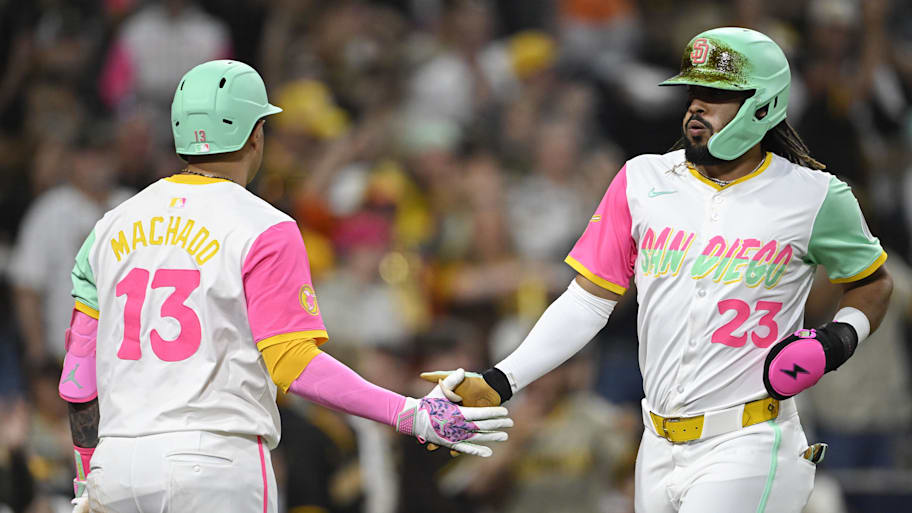
The Padres' colorful City Connects may get retired after this season, but they are a staple alternate as long as they remain on the diamond. The pastels will be missed as they scream San Diego and are a nice change of pace from the Padres' traditional brown and gold.
6. Arizona Diamondbacks

The Diamondbacks brought back the purple and teal for their new City Connect uniforms, which were unveiled this season. Their previous, sand-colored City Connect jerseys also included "Serpientes" across the front, which is Spanish for snakes. The jerseys even include a snakeskin pattern and faux sleeves as a callback to their classic vest jerseys. These are a perfect combination of franchise history and the Phoenix culture—nicely done.
5. Miami Marlins
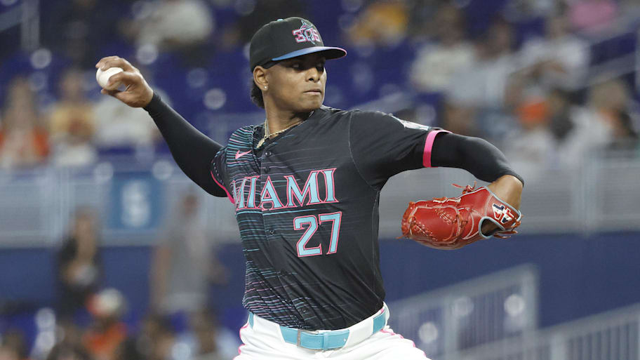
The Marlins became the first MLB team in history to use an area code as the main logo on a hat. And it's perfect the first city to have that honor is the 305. The teal and pink is definitely Miami Vice inspired, but it's also nice to see the Marlins bring some teal back from their classic teal, black and silver uniforms. The teal and pink stripes throughout scream Miami nightlife, but they're also a fresh, modern take on pinstripes we see across so many classic baseball uniforms.
4. Chicago White Sox
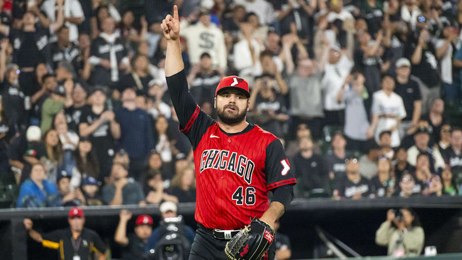
Love it or hate it, marrying two sports franchises for an alternate jersey is undoubtedly cool. Especially when you consider Michael Jordan's history with the Chicago White Sox. This jersey is an awesome piece for fans to wear to a Chicago Bulls game. A baseball jersey and basketball jersey all at once as an ode to one of the NBA's most storied franchises—pretty unique.
3. Toronto Blue Jays
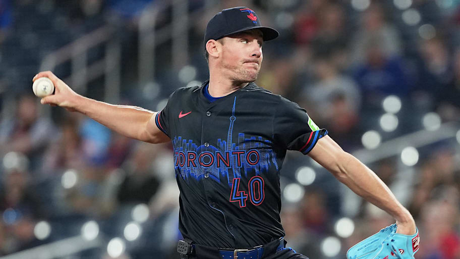
Even if a little abstract, the Toronto skyline is the perfect centerpiece for the Blue Jays' City Connect uniform. The CN Tower pokes out into view from the Rogers Centre, which makes for an epic baseball setting. Whether you like the all-black look or not, these are inspired by Toronto's nightlife and are the first dark Blue Jays jerseys since the early 2010s when the team wore silver and blue. A solid mix of past, present and future, adorned with the calling card of a game at Rogers Centre.
2. Tampa Bay Rays
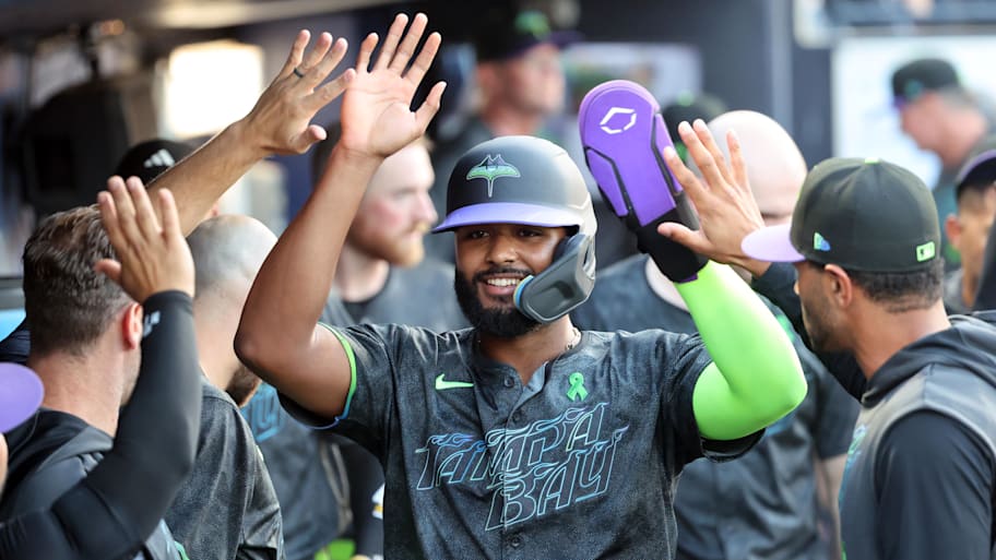
Tampa Bay's City Connect uniforms have it all—flames bursting through the font, the city's bridge mixed with a sting ray on the logo and even a skateboarding ray as an alternate logo. Neon isn't for everyone, but the Rays mixed the bright colors with a dark base to end up with a beautiful product.
1. Boston Red Sox
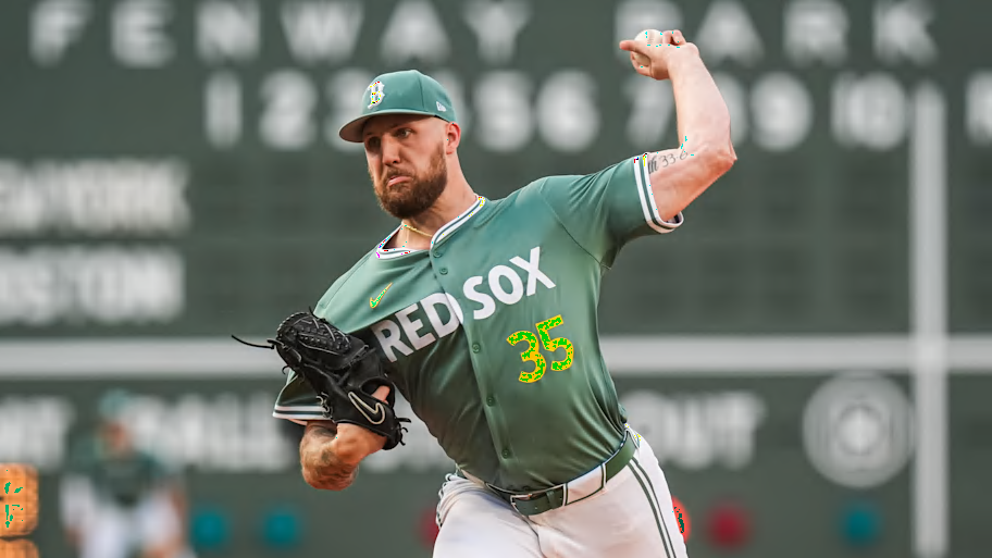
Wearing a Green Monster inspired uniform while playing in front of the Green Monster is about as cool as it gets. Boston's new "Fenway Greens" stole the show of the new City Connect uniforms released this year. If the Red Sox wear a different color, the hues of Fenway Park are perfect. The matching wordmarks and numbers paired with the foul-pole yellow takes these over the top. Their previous Patriots' Day-inspired City Connects aren't bad, but keep the Fenway Greens in rotation forever.
More MLB on Sports Illustrated
This article was originally published on www.si.com as Ranking Every MLB City Connect Jersey in the 2025 Season From Worst to Best.